The digital medium is, by default, color. So are most of the film images (negatives or slides) you may have had digitized in the last years to prevent them from hopelessly fading into oblivion. Still, some of your digital files may benefit from conversion to monochrome. We may identify three main reasons to do that:
- Photographer's choice. Some subjects simply look better in black and white.
- Badly botched white balance in the original image, beyond a hope of recovery.
- Faded colors in the scanned negative or, especially, slide.
This is in addition to a conversion necessitated by publishing requirements, when a picture has to be printed in B&W.
Conversion techniques
The simplest way to convert a color, digital or digitized, image is to desaturate it in an image editor program. Depending on the particular software you are using, this may be a matter of just choosing the Desaturate operation, or moving the saturation slider in color adjustment options all the way to the left. Some programs also may have an explicit "Convert to Monochrome" operation available.
Things are not so simple, though. In the classic black-and-white process, silver halide grains in the emulsion respond to the incident light with sensitivity depending on that light's wavelength, or, roughly speaking, color. (These two are not equivalent, as a given color, as perceived by the human eye, may correspond to a single wavelength, or a mix of various lengths: e.g., the same shade of yellow may be achieved with just a pure 570 nanometer wave or with a mix of, say, 520 and 630 nm ones.)
The grain sensitivity (read: resulting negative density) varies with wavelength, and this response depends on the emulsion type. Early emulsions were "color-blind", with a very strong response to blue (short wavelengths) and almost no response to red (long ones). That's why we see paper-white skies on most of the very early photographs. While our eye responds very strongly to yellow light, those emulsions were weakly sensitive to it; often resulted in the picture tonality which was perceived as "natural".
Later on, manufacturers started adding sensitizers to emulsions, thus increasing sensitivity to longer (more reddish) wavelengths. We've seen ortochromatic films (still largely blind to red), orto-panchromatic, panchromatic, and superpanchromatic, the last ones overly (as compared to the human eye) responsive to reds. The tonality of a B&W image will therefore depend on the type of film used, although in the last fifty years panchromatic films were the norm.
The process can be affected to a large degree by using color filters. A yellow, orange, or red filter will help in darkening the blue sky, bringing out white clouds; a blue one will bring tan to a pale face, while a green filter will lighten the foliage — all this may help the photographer to bring in the desired effect.
When converting a color image to monochrome in digital postprocessing, for each pixel we have available its three basic components: red, green, and blue. Therefore in the conversion process we have the luxury of deciding how much effect will each component have on the final luminosity. For example, forgoing the green and blue components you will have an equivalent of shooting monochrome through a strong red filter.
Most graphic programs allow you to split a color picture into the three individual components. Each of these is available for editing as a separate monochrome image; then they can be "mixed" back together in desired proportions, and the result can be desaturated. Adjusting these proportions is somewhat like shooting monochrome with a color filter; in addition, individually adjusting the tonal curves of separate components will be equivalent to applying a different filter to different regions of the image (shadows, mid-tones, highlights).
I hope you are not looking for a ready-made recipe for B&W conversion. The best way is just to start experimenting. Luckily, a simple process of splitting the image into three channels and then, before desaturation, merging them in desired proportions, is good enough for most of the applications.
There are also a number of Photoshop-compatible plug-ins with the sole purpose of monochrome conversion. What the best of them are doing, is exactly what I've described above: splitting an image into color layers, applying some tonal adjustment to each layer, and combining them back into a monochrome image. If you find one with results you like, use it; I prefer to do it by hand, experimenting and learning in the process.
Let us have a look at three case examples, each illustrating one prevailing reason for monochrome conversion, as listed above. (All postprocedding was done in Corel Photo Paint using options available in any decent image-editing program.)
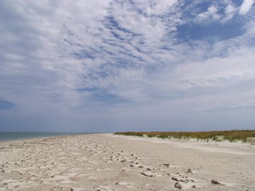
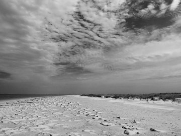
Case example: Photographer's choice
This is a snapshot of an empty beach on the Portsmouth Island in the Outer Banks, NC. (The island, once a home to one of the busiest towns in the area is now uninhabited). The original, color picture is flat and trivial; the monochrome one (made of the red channel alone) — more interesting, almost dramatic (see the XGA version). Olympus E-10, auto WB, no exposure compensation.
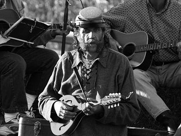
Case example: Botched white balance
This image, of a bluegrass band performing on a farm near my home in Maryland, is a hopeless case of white balance: some areas are washed in a late-afternoon sunlight, while the shadows are filled-in by open-sky, much cooler, light — still strong at that time of the day. The color original is quite disgusting, even if you don't count the burned-out highlights. (Olympus E-500, -0.7 EV exposure compensation, WB at 5300K)
While I could bring the shadows out of the blue by making the other parts more reddish, and while I could play more with the individual RGB curves to make the image acceptable, I chose to desaturate it instead. The result, after some additional tone adjustment, is shown in the first monochrome version.


The second conversion was made using mostly the blue layer of the original. While I prefer the first one (see the XGA version), here we can see the overall reduction in contrast, and much more shadow detail: after all, shadows were illuminated mostly by the light scattered off the sky. In some situations this approach may be useful.
(Note added: Indeed, the second version may look better as a thumbnail on a computer scren, being more readable in the shadows.)
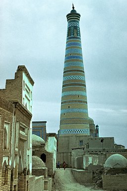
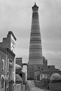
Case example: Faded colors
I have a huge collection of slides, some of them dating back to the Sixties. Unfortunately, colors in slides tend to fade with time, especially for the East-German ORWO film I was using. (The film was also sold in the U.K. and it was not so bad, except for durability.) Here is a picture shot in Khiva, Uzbekistan (former Soviet Union), in 1978. (Camera: Soviet Start SLR.)
The slide was scanned by Kodak to the Photo CD format (not to be confused with the mass-market Picture CD), and the colors were very, very faded. To make things worse, various color components faded to a various degree, additionally depending on the overall luminance. The color version shows the best I could come up with in the correction process, not good.